-
-
-
-
 NEWSharing is Daring With the Play Your Way SetSpecial Price €169SaveWorth €258You save: €89 (34%)
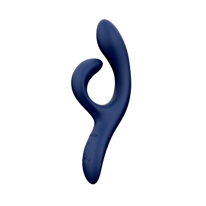

Sex Toys For Couples TEST We-Vibe puts couples first with our selection of the most exciting sex toys for couples, including remote sex toys for long distance relationships. Discover how to spice things up and heighten your pleasure – whether together or apart. Find out how to choose the best sex toys for couples.
 We-Vibe
-

Pre Title
Title
Subtitle
-
Temp
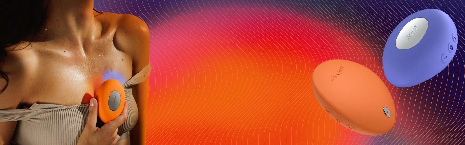
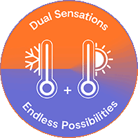
The New Way
of Temperature Play

Play and Discover
Play together with We-Vibe Couples Toys
A world of play is one touch away
What is Lorem Ipsum?
What is Lorem Ipsum?
Wow Tech Product Text Image
Desktop: 925x521, Mobile: 768x801, JPEG. Video: mp4 (file should not exceed 2 MB).
Don’t let distance get in the way of your passion.
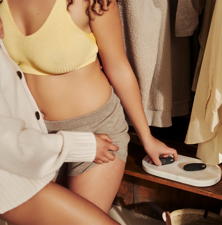
Don’t let distance get in the way of your passion.


Don’t let distance get in the way of your passion. Center

Don’t let distance get in the way of your passion.
WOW Tech Product Video Text
Desktop: 1920x1080, Mobile: 770x946, JPEG. Video: mp4 (file should not exceed 2 MB).
Don’t let distance get in the way of your passion.

Don’t let distance get in the way of your passion.
WOW Tech Product Images Row
Desktop: 253x253, Mobile: 369x369, JPEG
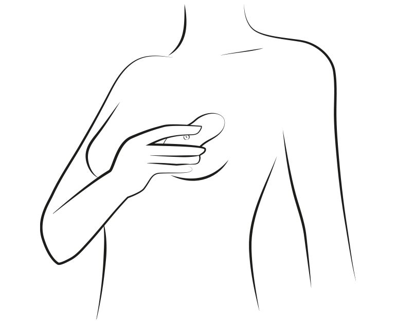
How the WOMANIZER DUO works


WOW Tech Image Tiles
Desktop & Mobile: 72x72, JPEG
Designed for You


WowTech Product Simple Text Image
Desktop & Mobile: 1920x640, JPEG
Lorem ipsum dolor sit amet, consectetur adipiscing H3

WOW Tech Breaker Banner
Desktop & Mobile: 1920x427, JPEG
Grouped Review Slider
Desktop & Mobile: 400x400px, JPEG

Row of Cards
Desktop & Mobile: 400x400px, JPEG

CMS Block
WOW Tech Product Slider
WOW Tech Newsletter
WOW Tech Product Compare
Heading
 Shape #1
Subtitle #1
Shape #1
Subtitle #1
|
Shape #2
Subtitle #2
|
Shape #3
Subtitle #3
|
|
|---|---|---|---|
| Intensity | |||
| We-Connect | no | yes | yes |
| Modes | 10+ | 10 | 10 |
| Waterproof |
Base Styles
Header 1
Header 2
Header 3
Header 4
Header 5
Header 6
Lorem ipsum dolor sit amet, consectetur adipiscing elit, sed do eiusmod tempor incididunt ut labore et dolore magna aliqua. Ut enim ad minim veniam, quis nostrud exercitation ullamco laboris nisi ut aliquip ex ea commodo consequat.
- Please fix widget styles that are broken on this demo page.
- Please include default styles for paragraph, lists, headers, & table in the demo template. Please also include custom headers.
- Please create a template with all widgets, default styles and custom headers.
- Once complete, we will duplicate that template to create a 2nd template for Marketing.
- Marketing should be able to create a page using a template and have the ability to remove blocks as needed without affecting the template.
- ol list item
- ul list item
- list item
- list item
Bootstrap
Aligned Text
Left-aligned text using the text-start class.
Right-aligned text text-end class.
Center-aligned text text-center class.
No wrap text text-nowrap class.
Text Transform
text-lowercase
text-uppercase
text-capitalize
Font Size
.fs-1 text
.fs-2 text
.fs-3 text
.fs-4 text
.fs-5 text
.fs-6 text
Display Headings
Display headings are used to stand out more than normal headings with a larger font-size and lighter font-weight. There are six classes to choose from: .display-1 to .display-6
display-1
display-2
display-3
display-4
display-5
display-6
Line height
lh-1 This is a long paragraph written to show how the line-height of an element is affected by our utilities. Classes are applied to the element itself or sometimes the parent element. These classes can be customized as needed with our utility API.
lh-sm This is a long paragraph written to show how the line-height of an element is affected by our utilities. Classes are applied to the element itself or sometimes the parent element. These classes can be customized as needed with our utility API.
lh-base This is a long paragraph written to show how the line-height of an element is affected by our utilities. Classes are applied to the element itself or sometimes the parent element. These classes can be customized as needed with our utility API.
lh-1g This is a long paragraph written to show how the line-height of an element is affected by our utilities. Classes are applied to the element itself or sometimes the parent element. These classes can be customized as needed with our utility API.
Font weight and italics
fw-bold
fw-bolder Bolder weight text (relative to the parent element).
fw-semibold Semibold weight text.
fw-normal Normal weight text.
fw-light Light weight text.
fw-lighter Lighter weight text (relative to the parent element).
fst-italic Italic text.
fst-normal Text with normal font style
Contextual Colors
Use the contextual classes to provide "meaning through colors":
This text is text-muted.
This text is text-primary.
This text indicates text-success.
This text is text-info.
This text is text-warning.
This text is text-danger.
This text is text-secondary.
This text is text-dark.
This test is text-body (often black).
This text is text-light on background bg-warning (on bg-warning).
This text is text-white on background bg-warning (on bg-warning).
Contextual Backgrounds
Use the contextual background classes to provide "meaning through colors".
Note that you can also add a .text-* class if you want a different text color:
This text uses the bg-primary text-white classes.
This text uses the bg-success text-white classes.
This text uses the bg-info text-white classes.
This text uses the bg-warning text-white classes.
This text uses the bg-danger text-white classes.
This text uses the bg-secondary text-white classes.
This text uses the bg-dark text-white classes.
This text uses the bg-light text-dark classes.
This text use bg-body text-dark
This text use bg-white text-dark
This text use bg-transparent text-dark
Spacing Utilities
Set the spacing of an element with the {property}{sides}-{breakpoint}-{size} classes.
Omit breakpoint if you want the padding or margin to work on all screen sizes.
Bootstrap 5 has a wide range of responsive margin and padding utility classes.
They work for all breakpoints: xs (<=576px), sm (>=576px), md (>=768px), lg (>=992px), xl (>=1200px) or xxl (>=1400px)):
The classes are used in the format: {property}{sides}-{size} for xs and {property}{sides}-{breakpoint}-{size} for sm, md, lg, xl and xxl.
Where property is one of: m - sets margin p - sets padding
Where sides is one of: t - sets margin-top or padding-top b - sets margin-bottom or padding-bottom s - sets margin-left or padding-left e - sets margin-right or padding-right x - sets both padding-left and padding-right or margin-left and margin-right y - sets both padding-top and padding-bottom or margin-top and margin-bottom
blank - sets a margin or padding on all 4 sides of the element
Where size is one of: 0 - sets margin or padding to 0 1 - sets margin or padding to .25rem 2 - sets margin or padding to .5rem 3 - sets margin or padding to 1rem 4 - sets margin or padding to 1.5rem 5 - sets margin or padding to 3rem auto - sets margin to auto
How It Works
Note: To add margin to the left side, use the class ms-* (margin start) instead of ml-* (margin left).
To add margin on the right, use the class me-* (margin end) instead of mr-* (margin right).
Below is an example using classes for the right margin with a visual representation of their sizes. The same sizes apply to all directions (left, right, top, bottom) and for both margins and padding.
| Class name | Size | Visual representation |
|---|---|---|
.me-1 |
0.25rem |
|
.me-2 |
0.5rem |
|
.me-3 |
1rem |
|
.me-4 |
1.5rem |
|
.me-5 |
3rem |
|
Grid Classes
.col- (extra small devices - screen width less than 576px)
.col-sm- (small devices - screen width equal to or greater than 576px)
.col-md- (medium devices - screen width equal to or greater than 768px)
.col-lg- (large devices - screen width equal to or greater than 992px)
.col-xl- (xlarge devices - screen width equal to or greater than 1200px)
.col-xxl- (xxlarge devices - screen width equal to or greater than 1400px)
 <!-- Responsive columns, control width on different devices -->
 <div class="container">
 <div class="row">
 <div class="col-*-*""> <div>
 <div class="col-*-*""> <div>
 <div>
 <div>

 <!-- Auto Layout, equal width columns -->
 <div class="container">
 <div class="row">
 <div class="col> <div>
 <div class="col> <div>
 <div>
 <div>
Responsive Columns
First create a row (<div class="row">).
Then add the desired number of columns with (.col-*-*) classes.
The first star (*) represents the responsiveness: sm, md, lg, xl or xxl.
The second * represents a number, which should add up to 12 for each row.
Auto Layout
Let Bootstrap handle the layout automatically with the col class and each column will have equal widths. Use .col-sm|md|lg|xl|xxl to make the columns responsive.
Responsive Columns
Small Grid
Small devices are defined as having a screen width from 576 pixels to 767 pixels.
On extra small devices, it will stack (100% width).
Medium Grid
Medium devices are defined as having a screen width from 768 pixels to 991 pixels.
Auto Layout Columns
Use the unit-less .col class to create equal width columns for each breakpoint.Bootstrap will recognize how many columns there are and each column will get the same width.
*Use .col-sm|md|lg|xl|xxl to make the columns responsive.
Extra Small Grid (Auto Layout)
Use numbers to control the column width. Just make sure that the sum adds up to 12 or fewer (it is not required that you use all 12 available columns)
Auto Layout Columns, Responsive
Use the unit-less .col class to create equal width columns for each breakpoint.Bootstrap will recognize how many columns there are and each column will get the same width.
*Use .col-sm|md|lg|xl|xxl to make the columns responsive.
Small Grid (Auto Layout, Responsive Columns)
Medium Grid (Auto Layout, Responsive Columns)
Large Grid (Auto Layout, Responsive Columns)
XLarge Grid (Auto Layout, Responsive Columns)
XX Large Grid (Auto Layout, Responsive Columns)
Dev Test
WowTech Banner Slider
Text #1
Button text #1
Text #2
WowTech Image Tiles Rebrushed
WowTech Newsletter Subscribed Email (We-Vibe, Arcwave, Romp)
your email address
WowTech Newsletter With Country (Ajax) (We-Vibe, Arcwave, Romp)
WowTech Popup Newsletter (Romp)
WowTech Product Three Videos (mp4, brightcove) (We-Vibe)
WowTech Product Video (.mp4)
WowTech Single Banner Slider (We-vibe)

RISK FREE SHOPPING!
60 Day Money Back promise on
We-Vibe Chorus Purchases
WowTech Text
WowTech Text Block